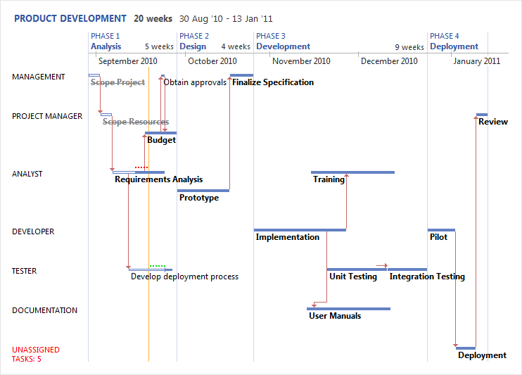
Do you hate Gantt Charts? Then you're going to love Vuedoo!
Vuedoo is the world’s first project scheduling software to feature the incredible Tufte Chart, a data-rich visualization of
startling clarity. Finally, a project chart that everyone can understand.
Communicate Plans
Vuedoo is an innovative scheduling tool for planning, managing and tracking projects. However, it is not just for project managers.
It is also an extremely clear and readable communication tool, with the flexibility to reach all project stakeholders. Vuedoo provides
customisable options to "slice and dice" project data to suit the intended audience — from high-level executive overviews
down to the finest detail for individual team members. At the same time, the information it conveys is richer and more concise than any
other project graphic.
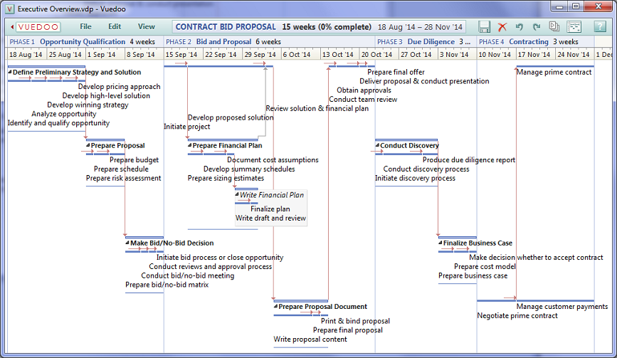
Here the Scroomer pane has been hidden to allow enough room for an overview of the whole project to be displayed in one page.
Notice also that even though the summary tasks are all closed up, the links between the subtasks of different summaries are still displayed.
In industry standard project management software, such links are hidden, losing valuable information when perusing an overview —
not only are many dependencies unseen, but the critical path will be incomplete or completely invisible.
View Ribbon
All the options for controlling how the data is displayed are available from the View Ribbon.
Some options are also available from the quick access toolbar.

From here, you can choose the project view and how the data in it is arranged.
"Choose Text" allows you to select the info you want to display in the chart.
Clipping the text as needed allows the task bars to be laid out in the most compact way possible;
showing full text allows you to see all of the info but the tasks will take up more space on the chart.
Changing the font size also proportionally changes the taskbar thickness. And the Scroomer can be moved or hidden.
The following describes specific scenarios for various roles and contexts.
|
Executive Overview
Upper management often just want to see a high-level view of what needs to be done, how long it will take
and the current status. They are not always necessarily interested in who is doing the tasks — that is a lower level detail. Vuedoo
provides another view for this purpose — the Timeline Chart — which just displays the tasks without grouping them into
resource rows. This allows the tasks to be laid out even more compactly — in a single straight line if possible — which thus
allows the viewer to see even more of the project at once. For a small to medium sized project, in this view one can often see the whole
project in one page. Here is an entire project showing just the top-level tasks in a very small area:

For larger projects, another way of showing all the tasks in one page is to use the Clipped
text option (in the View menu). Of course the trade-off is that you may not always be able to see the full task name,
but you can fit a lot of tasks into a small area:

The Timeline Chart can also be useful for project managers who wish to follow the standard
process and just create the task breakdown first without worrying about who will be doing what, then switching to the Tufte Chart
to do the resource assignments. Here is the same project as above showing all tasks in one page:
If required, the assigned resources can be displayed on the taskbars — select View/Choose Text.
And the assigned resource can be changed in the Task Properties dialog (double-click on a task).
|
Project Manager
There are many ways for a project manager to drill down to do detailed planning, scheduling and assignments.
Firstly, the Scroomer can be used to zoom or scroll to some subset of the project, e.g. Phase 2.
Secondly, some or all of the summary tasks can be expanded to reveal their subtasks to as many levels as desired.
Thirdly, resource rows can also be expanded or collapsed to allow the manager to focus on a subset of resources,
or to hide any resources that have no tasks in that part of the project.
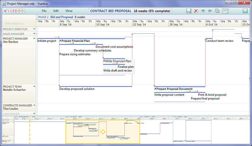
Another way to drill down into more detail is to use the Reveal All option (on the View ribbon),
which expands all the tasks in a different way: it moves the summary tasks out of the way to reveal just the detail tasks down to the
lowest level. This allows the manager to see more of the subtasks and to perform detailed assignment and load balancing with less distraction.
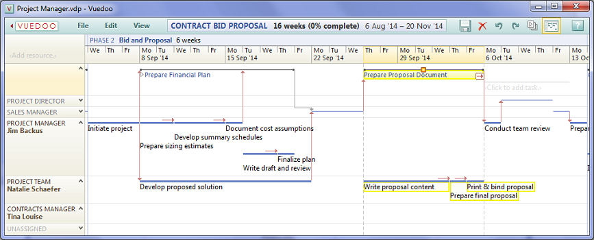
The summary tasks can be shown at the top of the chart to provide additional context, or hidden to provide more screen space.
Notice that when a summary task is selected at the top, it's subtasks are highlighted below on their resource rows.
Note also that in this example the Scroomer is hidden, but you can still zoom by dragging
the timeline, and pan in both directions at once by dragging the chart background directly.
|
Team Members
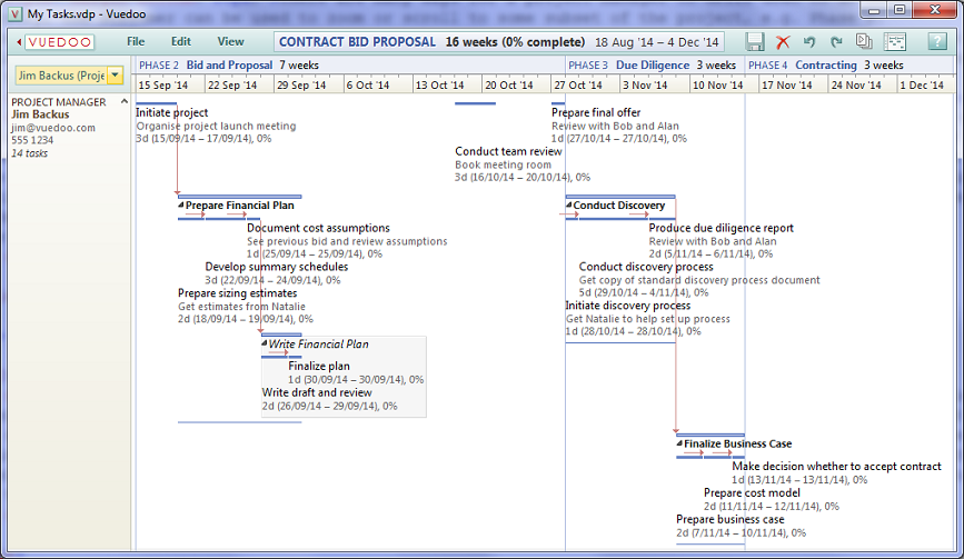
The My Tasks option (on the View ribbon) provides a highly detailed view of all the tasks
assigned to one resource. This is primarily aimed at allowing team members to clearly see what they need to do, without having
to search for their name scattered all over a Gantt Chart or Timeline Chart. However, it can also be used by project managers when
doing focused work on one resource at a time. The displayed resource can be selected from the drop-down menu in the top left corner
of this chart, or from the right-click menu on any resource in the full Tufte Chart. Notice the short notes that can be attached to
any task (the Description field in the Properties Dialog).
|
Gantt Chart
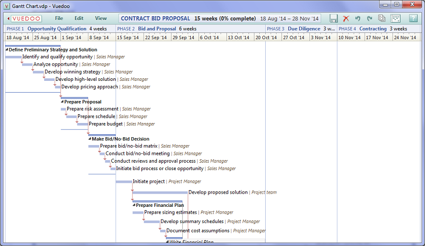
For completeness, a Gantt Chart is also provided for those who prefer a more familiar format.
Note that Vuedoo's Gantt Chart retains some of the Tufte Chart's advantages over the traditional format. For example,
phases across the top, names and other data right on the taskbars instead of in a separate spreadsheet, highlighting of
early/late status, showing links between subtasks of closed summary bars and highly intuitive direct manipulation
of all chart objects.
|
Vuedoo Reader
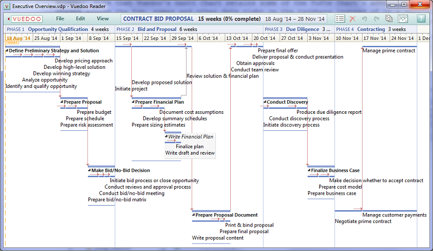
For those project stakeholders who just need to see and review a schedule but not modify it,
our free Vuedoo Reader allows them to do this without having to purchase additional software licenses.
This is not only a big saving for an organisation, but produces a much better result than the usual approach.
Having all the view options to play with is much more useful than a static .jpg or picture in a document et cetera.
And best of all, the Reader downloads and installs in seconds, without requiring admin permission.
|
Presentations
When giving a presentation using a projector, it is often useful to use
larger fonts for audience readability. The text size controls on the View menu allow you you to temporarily enlarge
all text in the chart. Notice that the taskbars are automatically resized to match the text size.
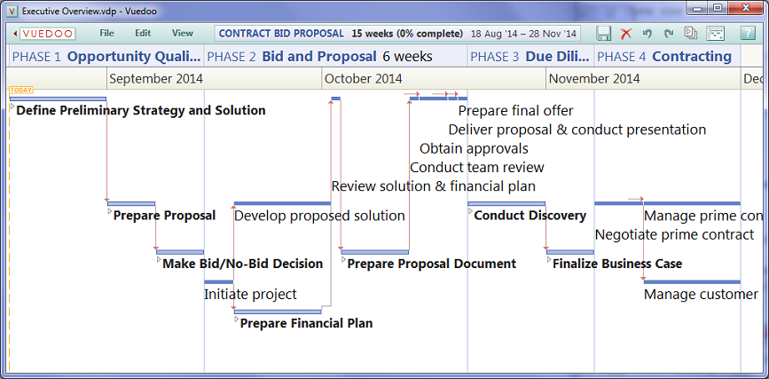
The text could also be enlarged for other reasons, e.g. if the person reading it is short-sighted.
Alternatively, the text can also be made smaller to fit more tasks into the screen area.
|
Printing
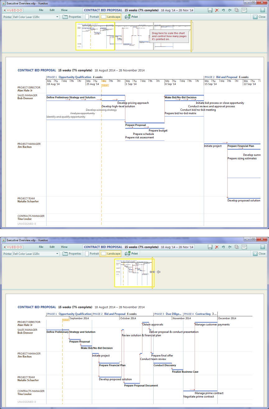
To print out a project, select Print from the File ribbon.
This will take you to the Print View, shown below. Similar to the other views, at the top is a scaled-down overview
of all the pages to be printed, and below that is an actual size single page selected from the overview.
There is also a Print Toolbar, from which you can select the printer, open the Printer Properties pages
and select the page orientation. You can also modify any of the view options on the View menu, and even make minor edits to the chart.
Finally, you can set the time scaling factor for the chart by dragging the Scaler
(the orange vertical bar on the right edge of the overview), which determines how many pages the chart is printed over
and also automatically calculates the time increments that will fit on the timescale (e.g. days, weeks, months, years).
When you are happy with the setup, click the Print button on the toolbar to send the chart to the printer.
|
As you manage and track your project, stay in control through high visibility: Control
|